
Simplifying Gifting for a Seamless Transaction
Home Depot’s gift card experience, redesigned with the customer in mind. An end-to-end journey that brings discoverability, choice, and seamless checkout together.
Overview
Home Depot’s Gift Card Business team aimed to transition from a third-party provider to an in-house solution. Initially scoped as an MVP to enable mixed cart functionality, the project evolved to include specialty gift cards and a fully updated design informed by user research. The goal was to improve usability, streamline checkout, and give the business greater control over the customer experience.
Problem Statement
Reliance on a third-party platform limited design control, optimization, and scalability
Customers could not purchase gift cards alongside other products
The legacy landing page lacked clarity, engagement, and alignment with user behavior insights
Approach and Process
Research & Insights
User Behavior
High reliance on search and navigation links to find gift cards
Many visits for balance checking
Confusion over hero banner, leading to misdirected clicks
Competitive Analysis Highlights
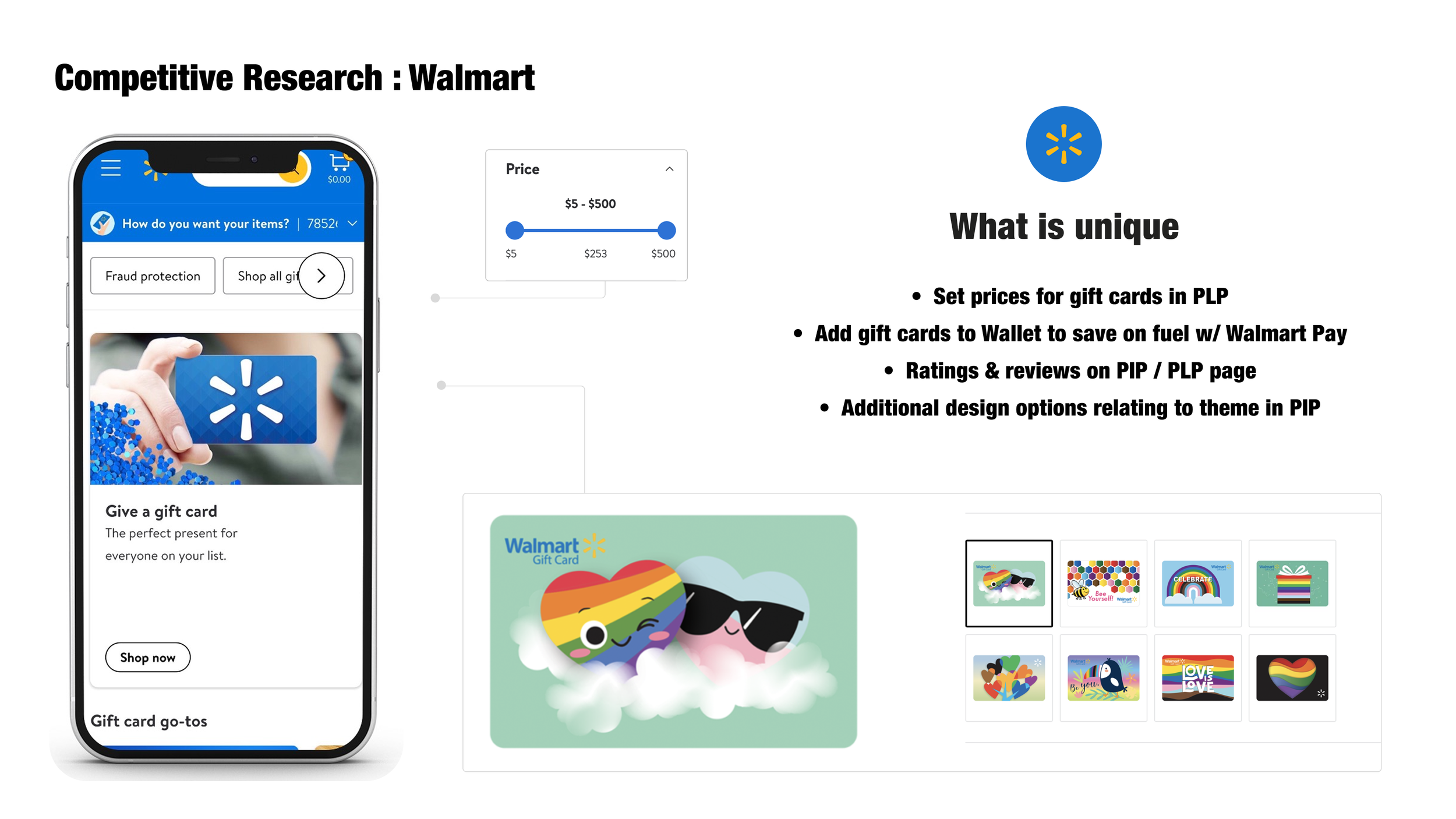
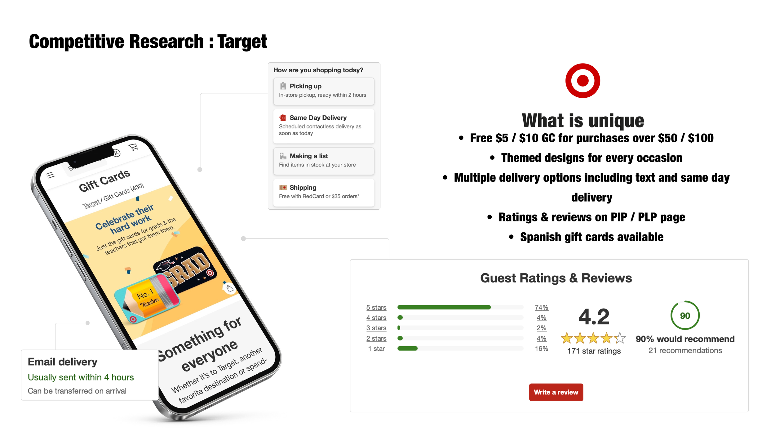
A competitive review of leading retailer gift card experiences revealed key differentiators worth considering. Walmart stood out for its adjustable pricing, Walmart Pay integration, and embedded ratings and reviews in the purchase flow. Target offered strong merchandising with themed designs, multiple delivery options, and purchase incentives. Together, these insights highlighted the importance of clear merchandising, variety, and seamless payment and delivery integration to drive engagement and conversions.
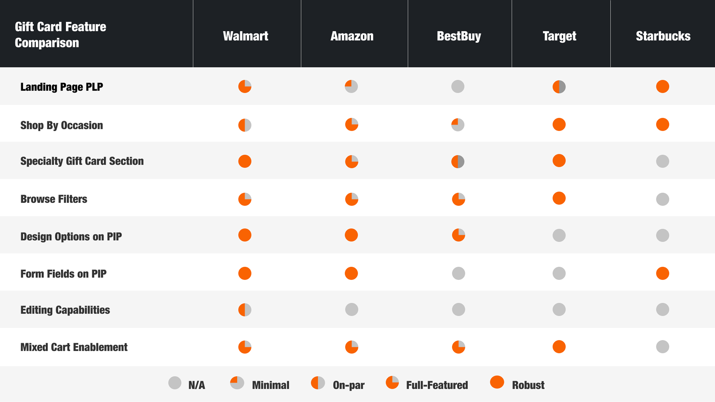
Feature Comparison Across Retail Leader
I compared key gift card features across leading retailers, evaluating everything from landing page structure to mixed cart enablement. This exercise not only revealed functional and experiential gaps in our own offering, but also surfaced best-in-class patterns—like robust card sections and flexible delivery options—that could inspire our solution. These insights became a blueprint for prioritizing features and elevating Home Depot’s position in the competitive landscape.
UX and Interaction Design
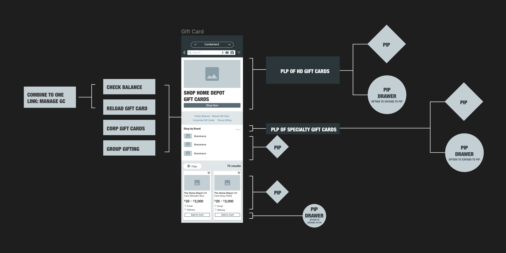
This flow distilled all research insights, product requirements, and business priorities into a clear landing page framework. By sharing it with engineering early, we ensured feasibility checks, surfaced dependencies, and aligned on a shared vision for the redesigned experience.
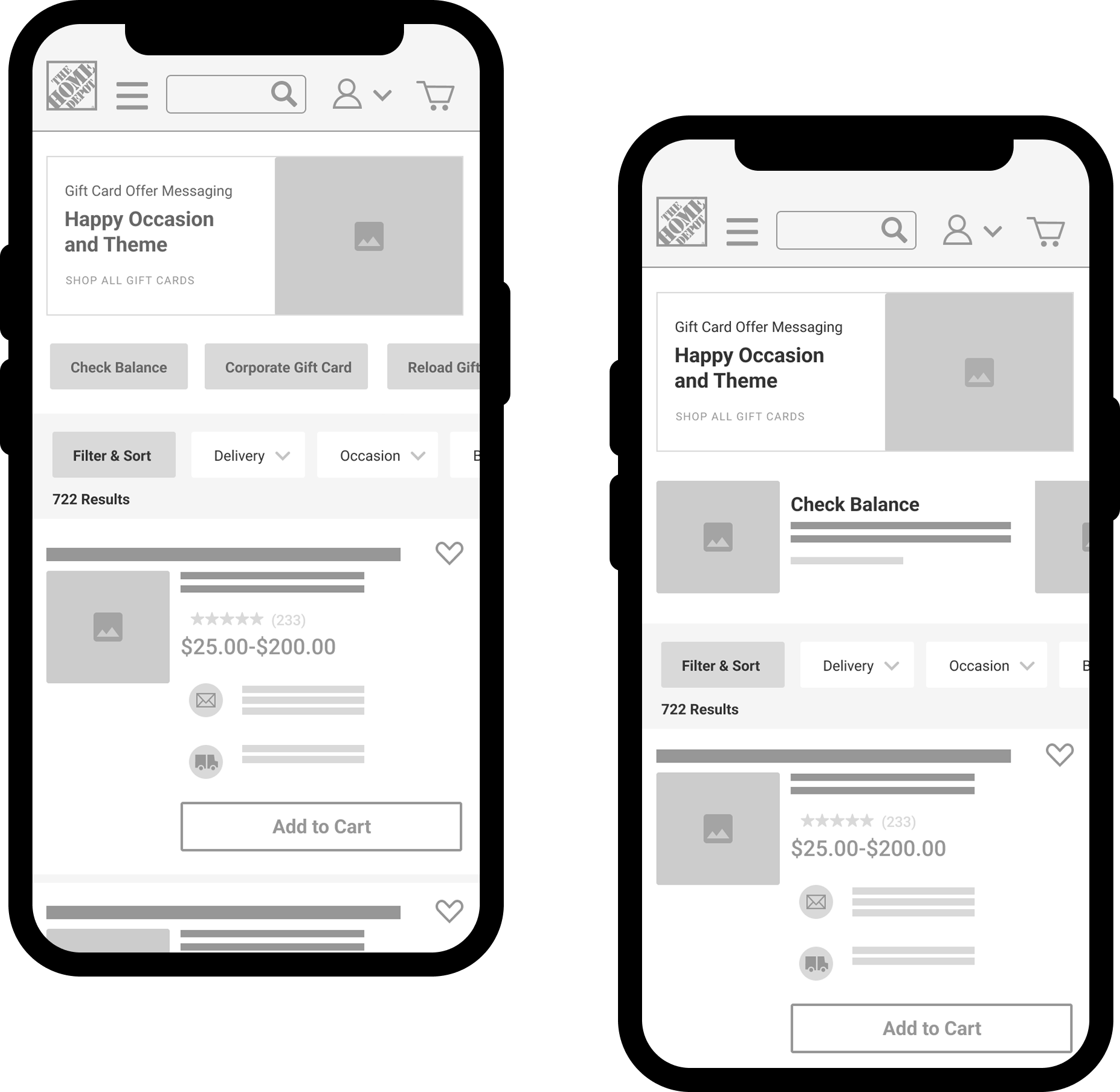
Clarity Through Wireframes
To translate ideas into actionable plans, I developed detailed wireframes that incorporated business requirements, product goals, and user insights. These low-fidelity layouts established visual hierarchy early, making it easier to validate content placement, navigation patterns, and functional elements. Sharing them with engineering and product teams created a common reference point, accelerating alignment and reducing rework in later design stages.
Testing Two Paths Forward
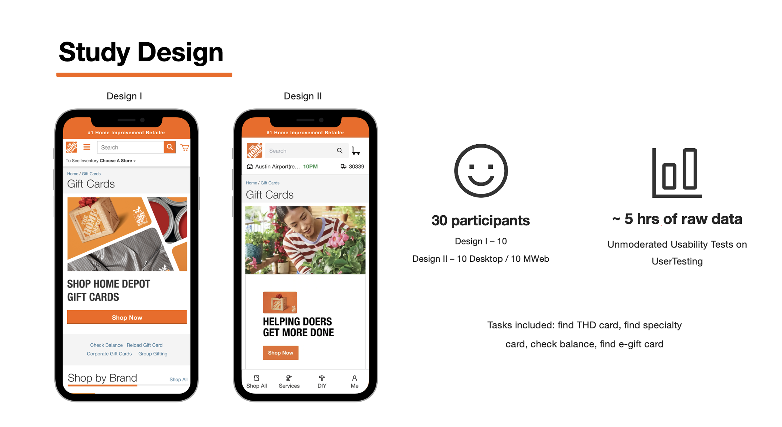
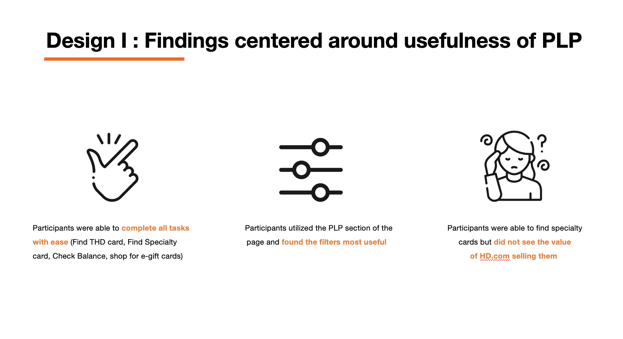
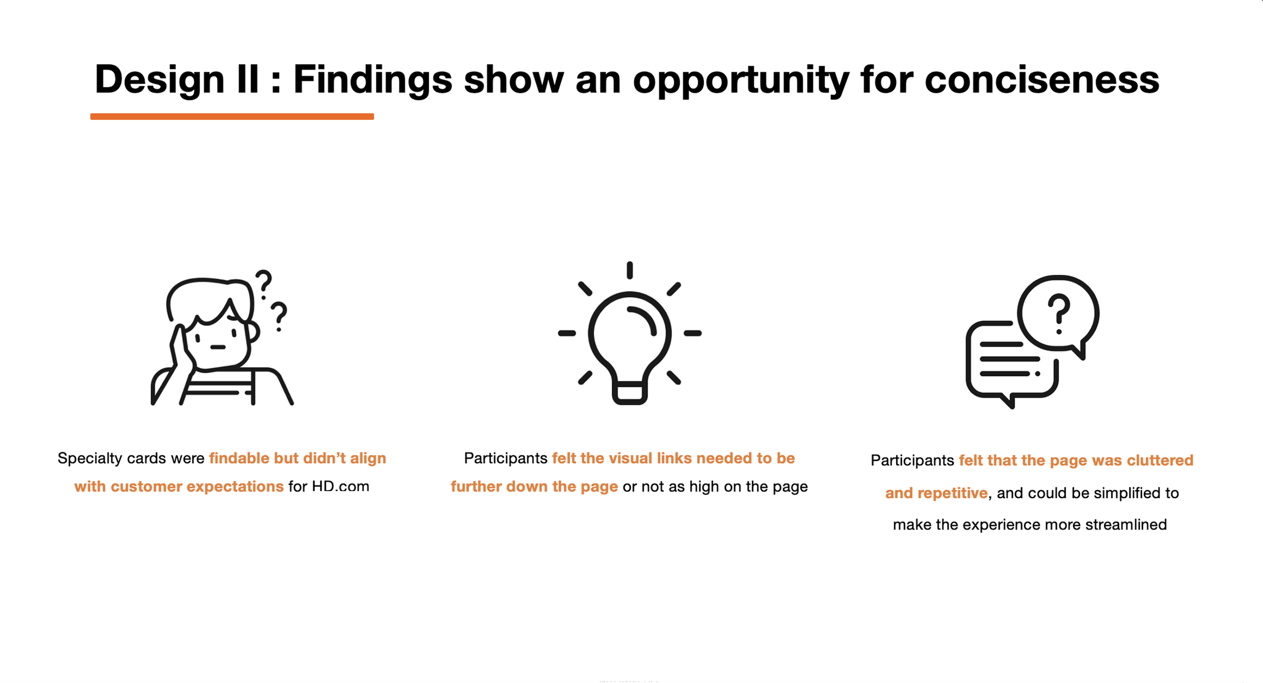
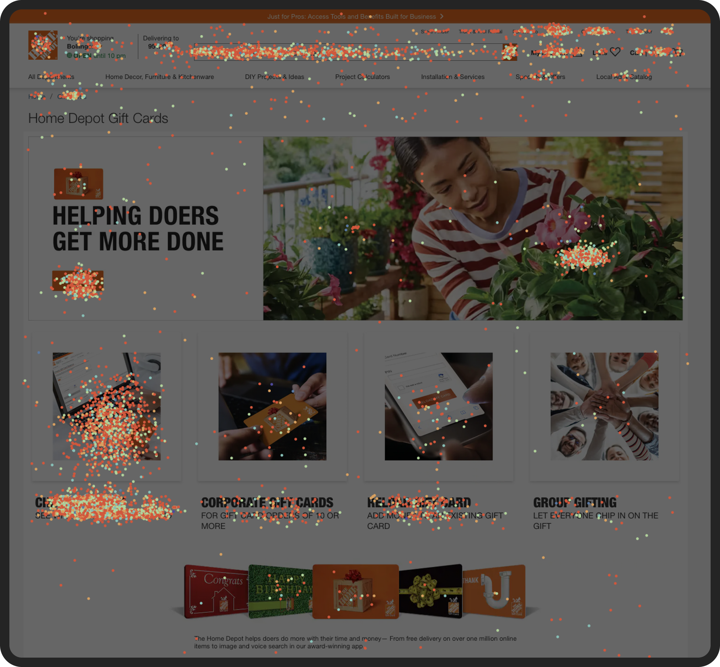
To validate our approach for the redesigned Gift Card landing page, we ran unmoderated usability tests comparing two distinct designs. Thirty participants, across desktop and mobile, were asked to complete critical tasks from both a purchaser and recipient perspective, including finding a Home Depot gift card, locating a specialty card, checking a balance, and purchasing an e-gift card. The sessions generated over five hours of raw data, revealing which design best supported clarity, navigation, and task completion.

Cross-Functional Collaboration and Implementation
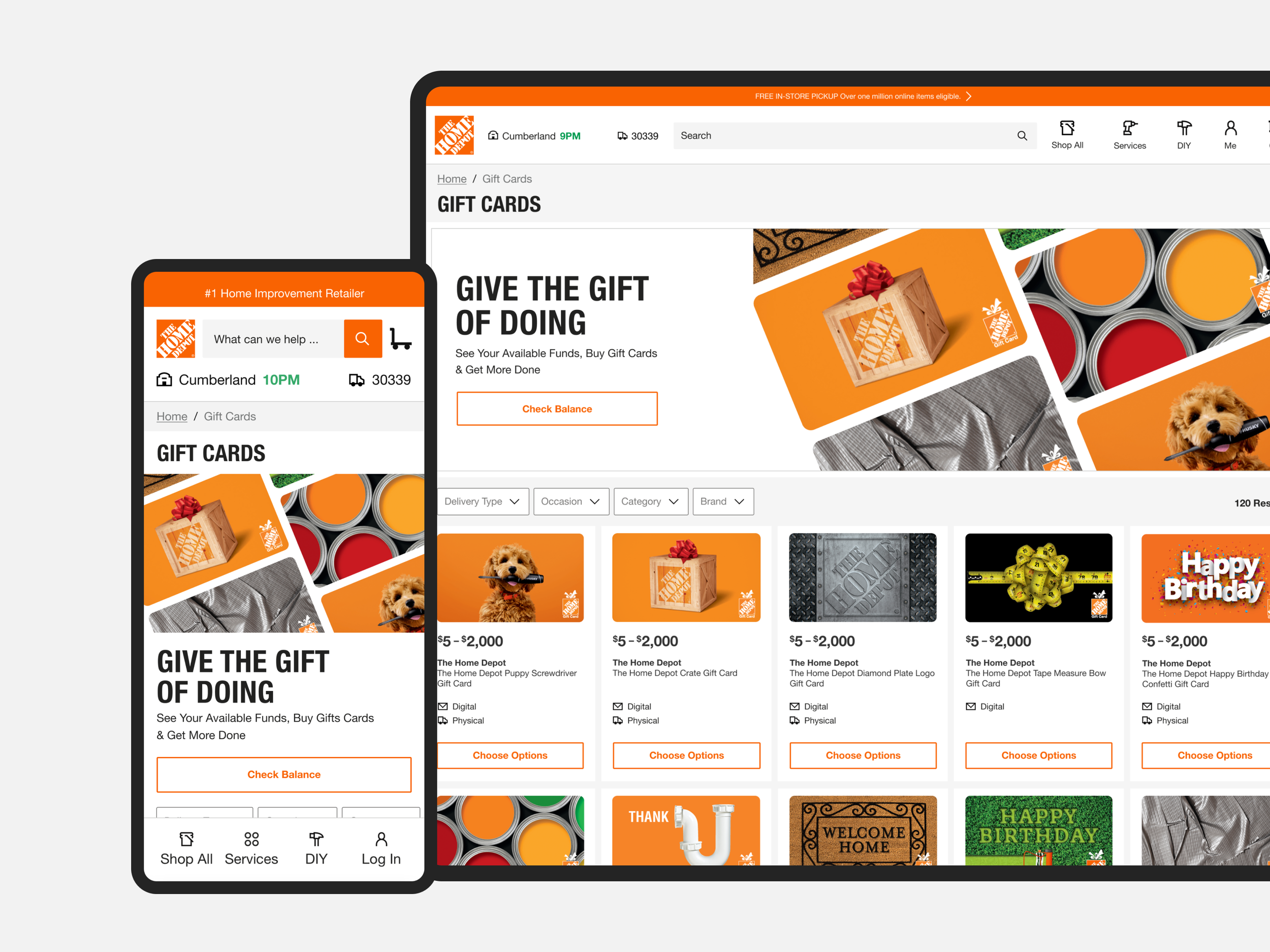
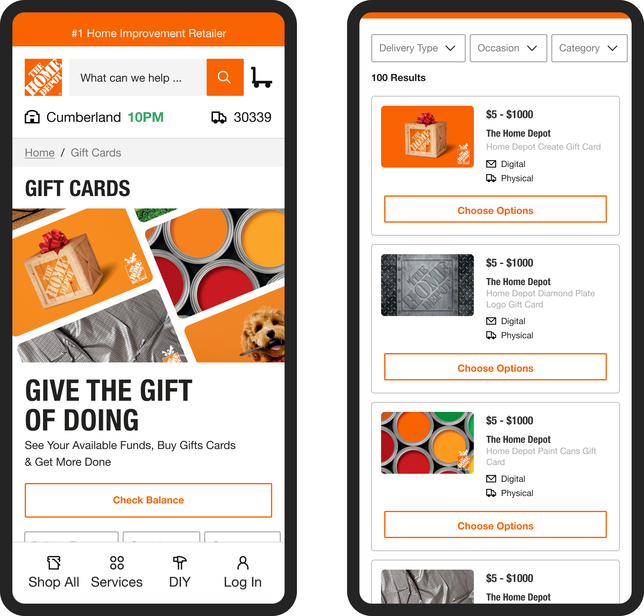
Leveraging my marketing design expertise, I crafted a gift card–centric hero that connected with both users and stakeholders. When compared to the creative marketing team’s concept, my design stood out for its clarity and relevance — earning the unanimous backing of the business, product, and design teams. The result not only replaced the existing banner but continues to serve as the main Gift Card page hero today.
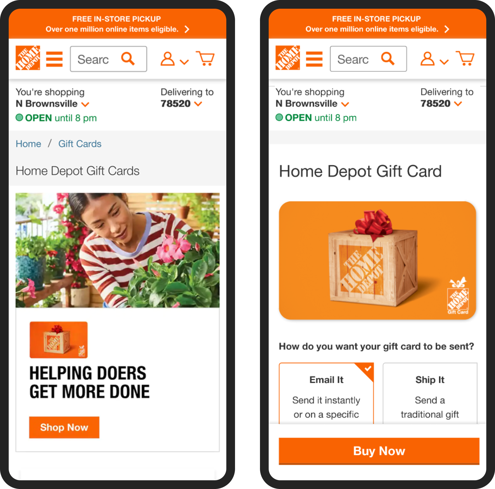
Integrating Gift Cards Seamlessly into Checkout
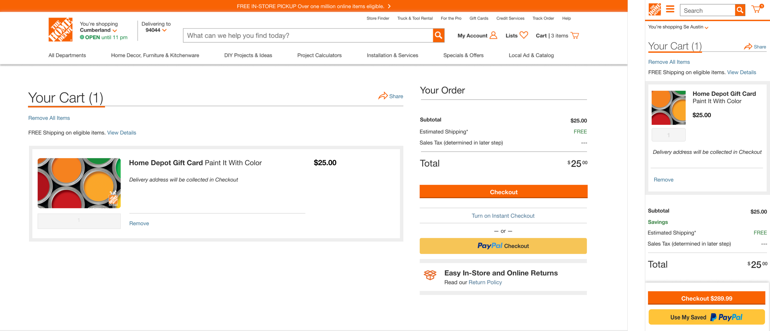
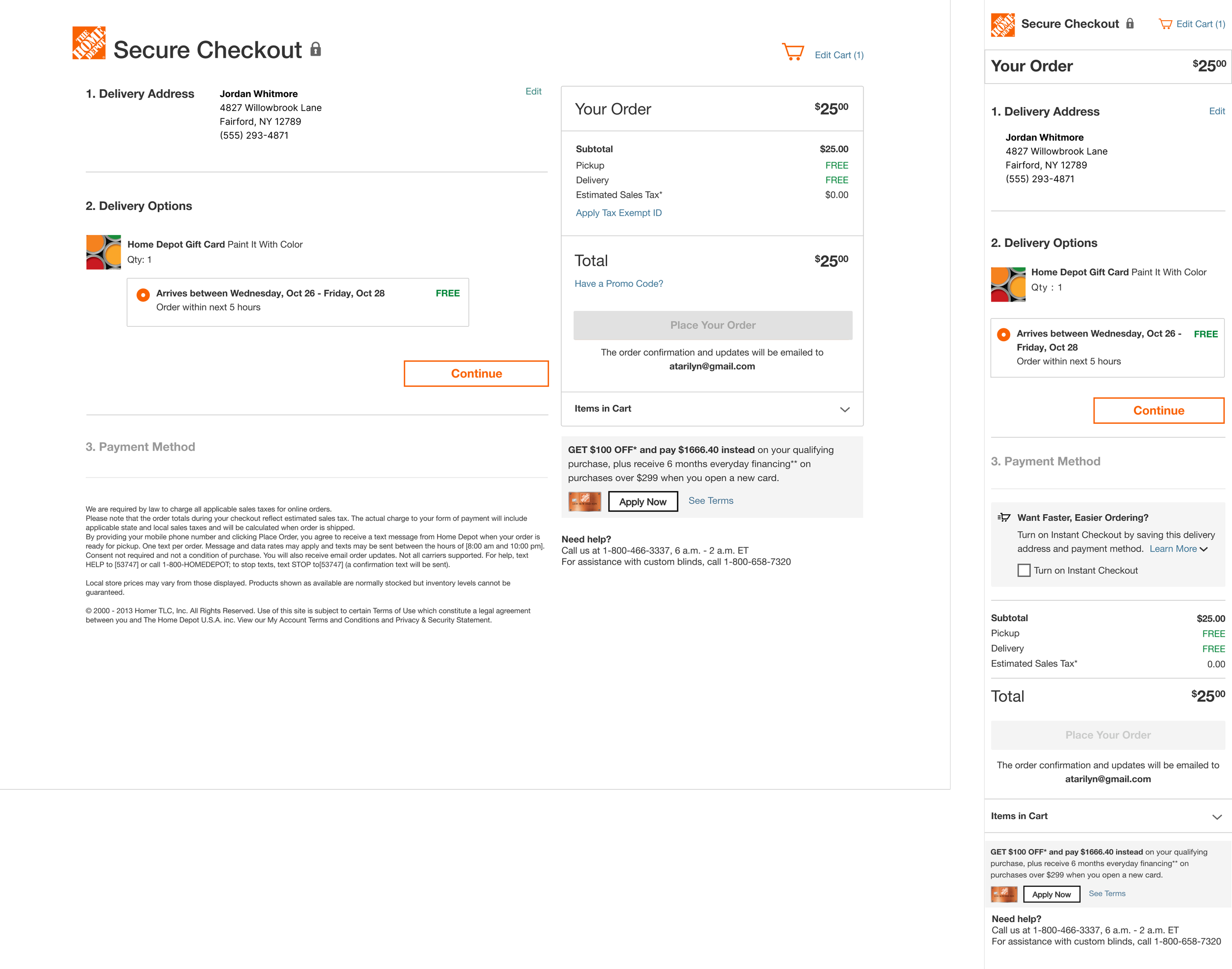
Transitioning away from a third-party checkout solution required reimagining how gift cards appeared and functioned within The Home Depot’s cart and checkout experience. Despite constraints — including the loss of “Save for Later” and fulfillment-switching features — I developed a streamlined system that supported both digital and physical gift cards, ensuring a consistent, intuitive experience for customers.
Conclusion
By delivering a more intuitive, visually engaging, and fully integrated gift card experience, we addressed both user frustrations and business constraints. The solution brought mixed-cart functionality, streamlined checkout, and improved discoverability for specialty gift cards — all anchored in research-driven design decisions.
The results speak for themselves: higher conversion rates, positive customer feedback, and a platform that empowers the business to adapt and grow. Starting with an MVP ensured we launched quickly with the most impactful features, while our scalable approach set the stage for future enhancements. From first click to post-purchase confirmation, every step of the flow now works harder to build trust, reduce friction, and drive engagement.