The Home Depot
Simplifying Gifting for
a Seamless Transaction
Home Depot's gift card experience, redesigned with the customer in mind — an end-to-end journey that brings discoverability, choice, and seamless checkout together.
Overview
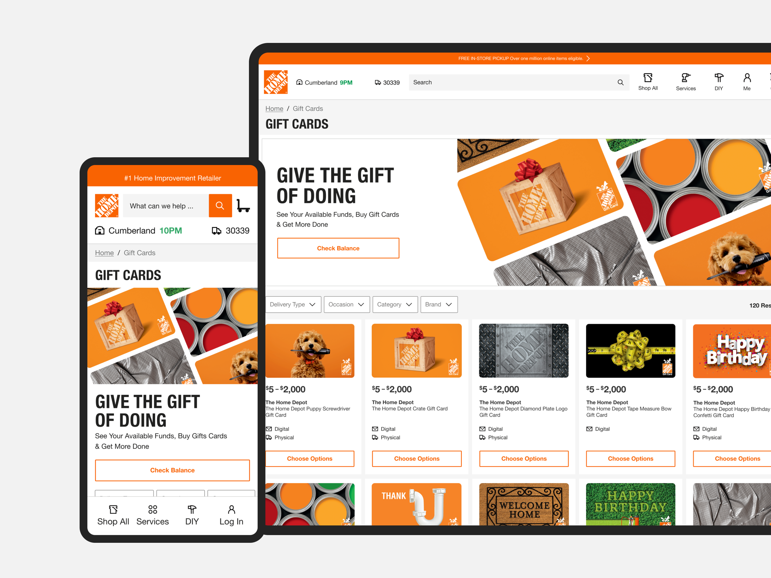
Home Depot's Gift Card Business team aimed to transition from a third-party provider to an in-house solution. Initially scoped as an MVP to enable mixed cart functionality, the project evolved to include specialty gift cards and a fully updated design informed by user research. The goal was to improve usability, streamline checkout, and give the business greater control over the customer experience.
Problem Statement
- Reliance on a third-party platform limited design control, optimization, and scalability
- Customers could not purchase gift cards alongside other products
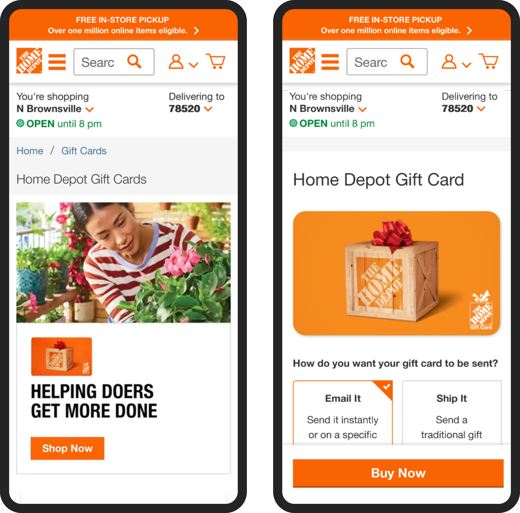
- The legacy landing page lacked clarity, engagement, and alignment with user behavior insights
Research & Insights
Before redesigning anything, I looked at how customers were actually behaving on the existing gift card page. Three patterns stood out.
Competitive Analysis
A competitive review of leading retailer gift card experiences revealed key differentiators that shaped our direction.
| Feature | Walmart | Target |
|---|---|---|
| Adjustable price amounts | ||
| Wallet / mobile payment integration | ||
| Ratings & reviews on the card page | ||
| Themed, occasion-based designs | ||
| Multiple delivery options |
Differentiators identified during this review — not an exhaustive feature audit. Together, they highlighted the importance of clear merchandising, variety, and seamless payment integration.
UX and Interaction Design
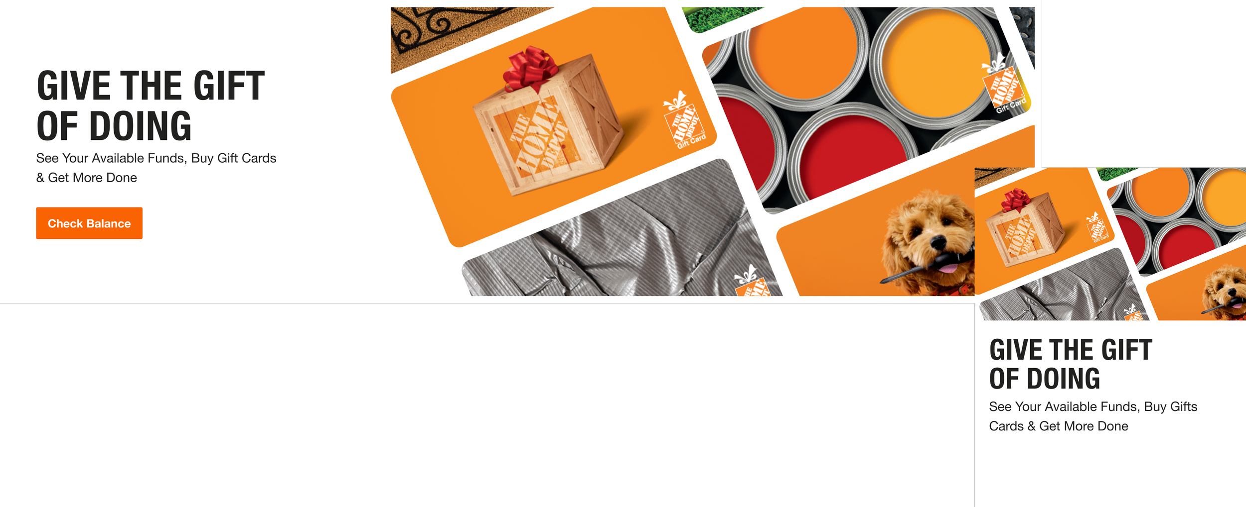
Testing Two Paths Forward
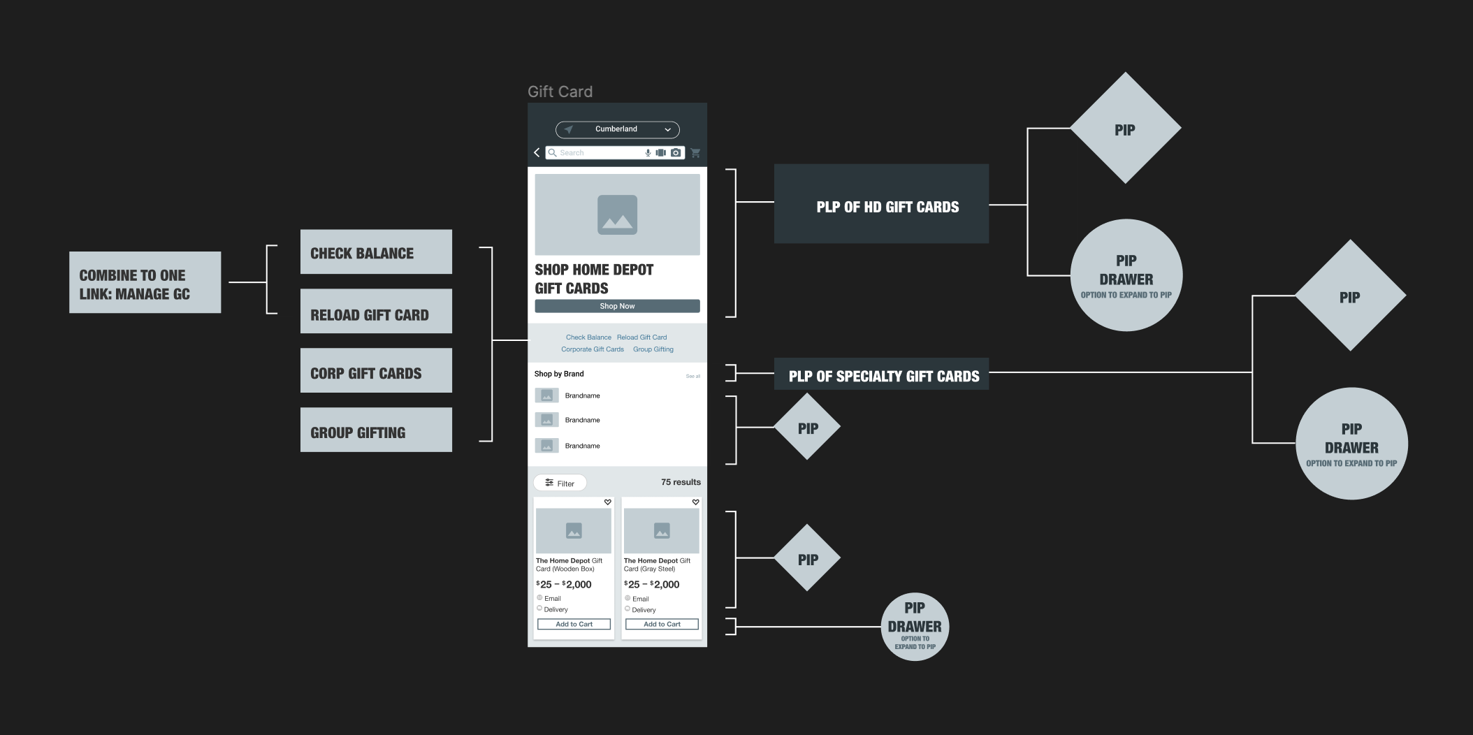
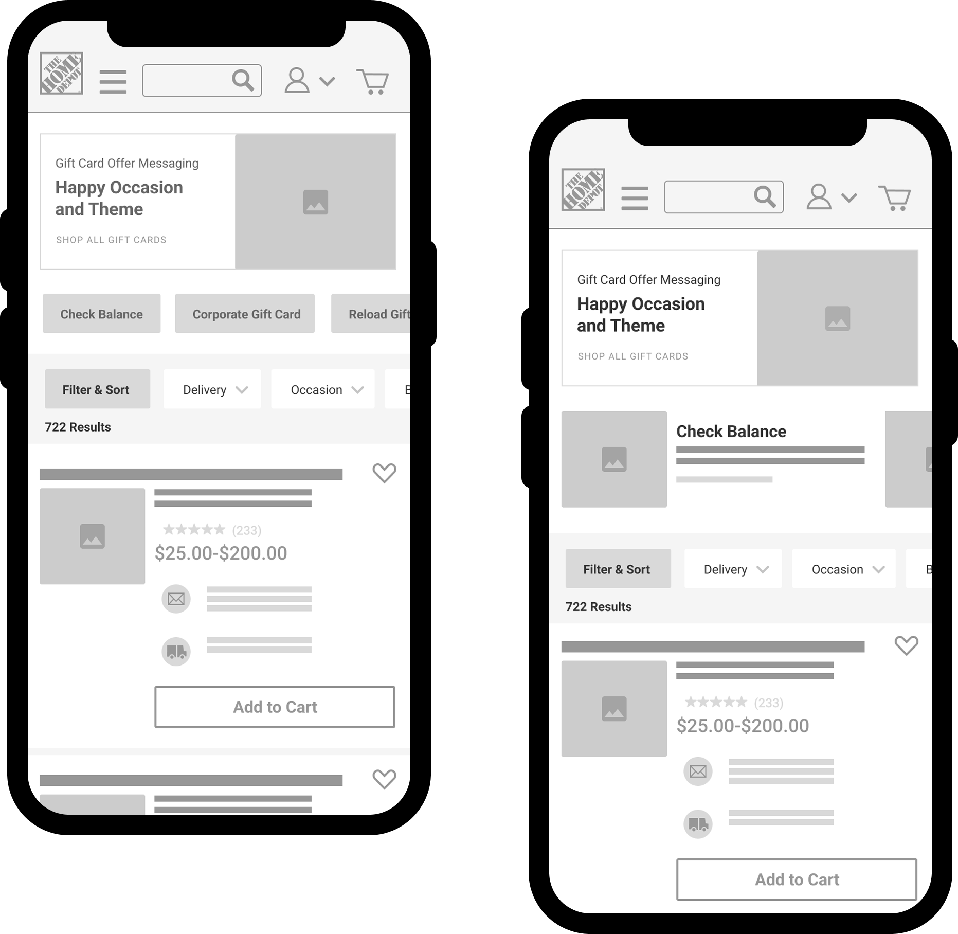
To validate our approach, I ran unmoderated usability tests on UserTesting comparing two distinct designs across desktop and mobile, with tasks framed from both a purchaser and a recipient perspective.
Participants completed all tasks with ease — finding the THD card, finding the specialty card, checking balance, and shopping e-gift cards.
Participants made heavy use of the PLP filters and called them out as the most useful part of the page.
Specialty cards were findable, but participants didn't see the value in Home Depot selling them at all.
Specialty cards were findable but didn't align with what participants expected to see from HD.com.
Participants felt the visual links needed to sit lower on the page — they weren't as useful as high up as they were placed.
The page felt cluttered and repetitive — participants felt it could be simplified to make the experience more streamlined.
Together, the two rounds shaped the direction that followed — Design I's straightforward task flow paired with the warmer, doer-focused tone Design II was reaching for, with the clutter trimmed out.
Integrating Gift Cards into Checkout
Redesigned for this case study to match the site's visual language — the underlying flow reflects what shipped.
Checkout
The gift card shows up as its own line item, with its own delivery option, right alongside payment.
Cart
A regular product and a gift card, in the same cart — the mixed-cart functionality this project was scoped to deliver.
Transitioning away from a third-party checkout solution required reimagining how gift cards appeared and functioned within The Home Depot's cart and checkout experience. I developed a streamlined system that supported both digital and physical gift cards, ensuring a consistent, intuitive experience for customers.
Conclusion
By delivering a more intuitive, visually engaging, and fully integrated gift card experience, we addressed both user frustrations and business constraints. The solution brought mixed-cart functionality, streamlined checkout, and improved discoverability for specialty gift cards — all anchored in research-driven design decisions. The results: higher conversion rates, positive customer feedback, and a scalable platform for future enhancements.