Walmart
Redesigning Walmart's
Candidate Experience
Redefining how Walmart attracts talent by blending UX and art direction to align with its mission of being People-led, Tech-powered.
The ask
"Make it feel more modern" — no further brief
What I started with
No existing data, roadmap, or creative brief
How it ended
Promoted to creative director, mid-project
Overview
This project started as an urgent ask to create a more modern alternative to what Deloitte was proposing for Walmart's new Careers site. At the time, Walmart was reviewing Deloitte's proposals with the intention of signing them for the full project, but leadership felt the concepts didn't align with the company's vision for the future. I was asked to take a shot at reimagining the experience — with no data, roadmap, or detailed brief beyond "make it more modern."
What began as a design exploration quickly evolved into a larger creative vision that positioned me as the Creative Director for the entire project. Drawing on a personal experience, I presented a new direction that resonated deeply with leadership. From there, I collaborated closely with Deloitte to uphold the creative vision and guide the project's overall design direction.
Research: One Brand Voice, or Two?
Walmart's hiring needs span two consumer-facing retail brands — Walmart and Sam's Club — both drawing from the same associate benefits and People systems, but carrying distinct names in the market. Before locking the new direction, I needed an answer to a question the brief never raised:
Rather than guess, I looked at how other companies handle a parent organization with more than one consumer brand underneath it — deliberately including cases with far more brands than Walmart's two, to see where the pattern held and where it broke.
| What I compared | Amazon + Whole Foods | Marriott (30+ hotel brands) | Yum! Brands (KFC, Taco Bell, Pizza Hut) | Walmart + Sam's Club |
|---|---|---|---|---|
| Separate URL or domain for the second brand | ||||
| Distinct visual identity per brand | ||||
| One shared hiring & application system | ||||
| Shared employment terms & benefits | ||||
| Parent company name visible to applicants |
A pattern held across every example: the more two brands diverge in employment terms and benefits, the more their hiring experiences split into fully separate destinations. The more they share infrastructure, the more they consolidate into one experience with brand-flavored sections, the way Marriott folds 30-plus hotel brands into a single careers.marriott.com.
Since Walmart and Sam's Club associates share the same benefits and People systems, the comparison pointed toward one shared Walmart Careers experience with a distinct Sam's Club section inside it, rather than a separate site.
Design Thinking
As a UX designer with a background in art direction, I made sure the experience solved for more than just pain points; it created an emotional connection that felt cohesive and holistic from first impression to final click. Drawing from my own experience of being newly hired and relocating to Bentonville — I infused what genuinely drew me to Walmart.
I did a competitive analysis of top tech companies and leading "Best Places to Work" employers to understand how they present their people and culture. Aligning to Walmart's mission of being People-led, Tech-powered, I designed a new homepage and hero section that broke away from its current experience, replacing it with authentic, relatable moments of associates in their real lives.
I presented this direction to leadership through a personal story that brought the vision to life, earning their buy-in and helping shift the focus from incremental updates to a bold, forward-looking redesign.
From Idea to Artifact
Recreated for this case study — original working files were not retained.
01 · Exploration
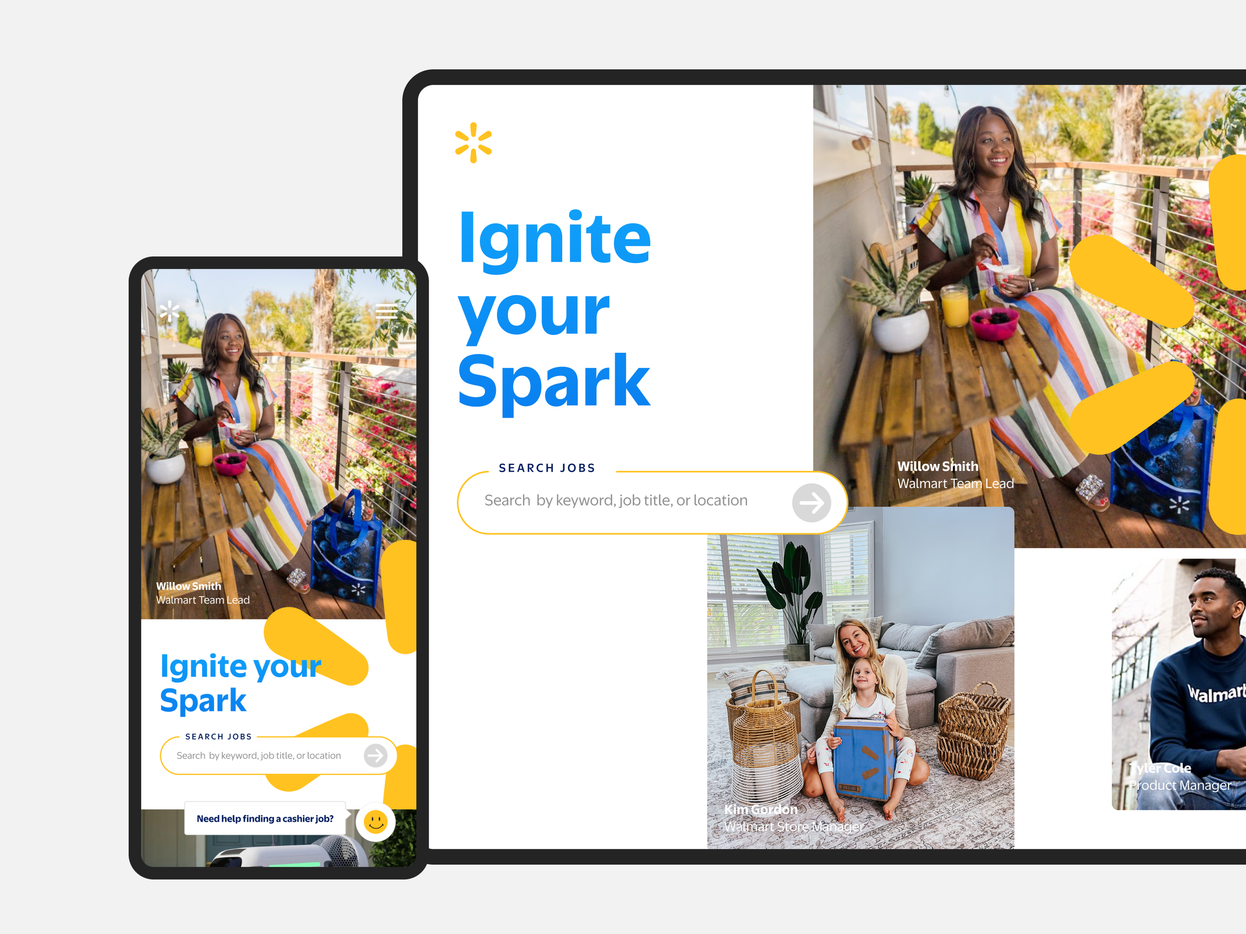
Loose sketches testing a phone-card format — real associate up top, headline and search below.
02 · Structure
Once the format held up, I locked hierarchy: photo, identity, headline, one search action — repeatable across people.
03 · Approved direction
Same structure, now built for real associate photography and a real name and title — this is what went to leadership.
Real People. Real Impact.
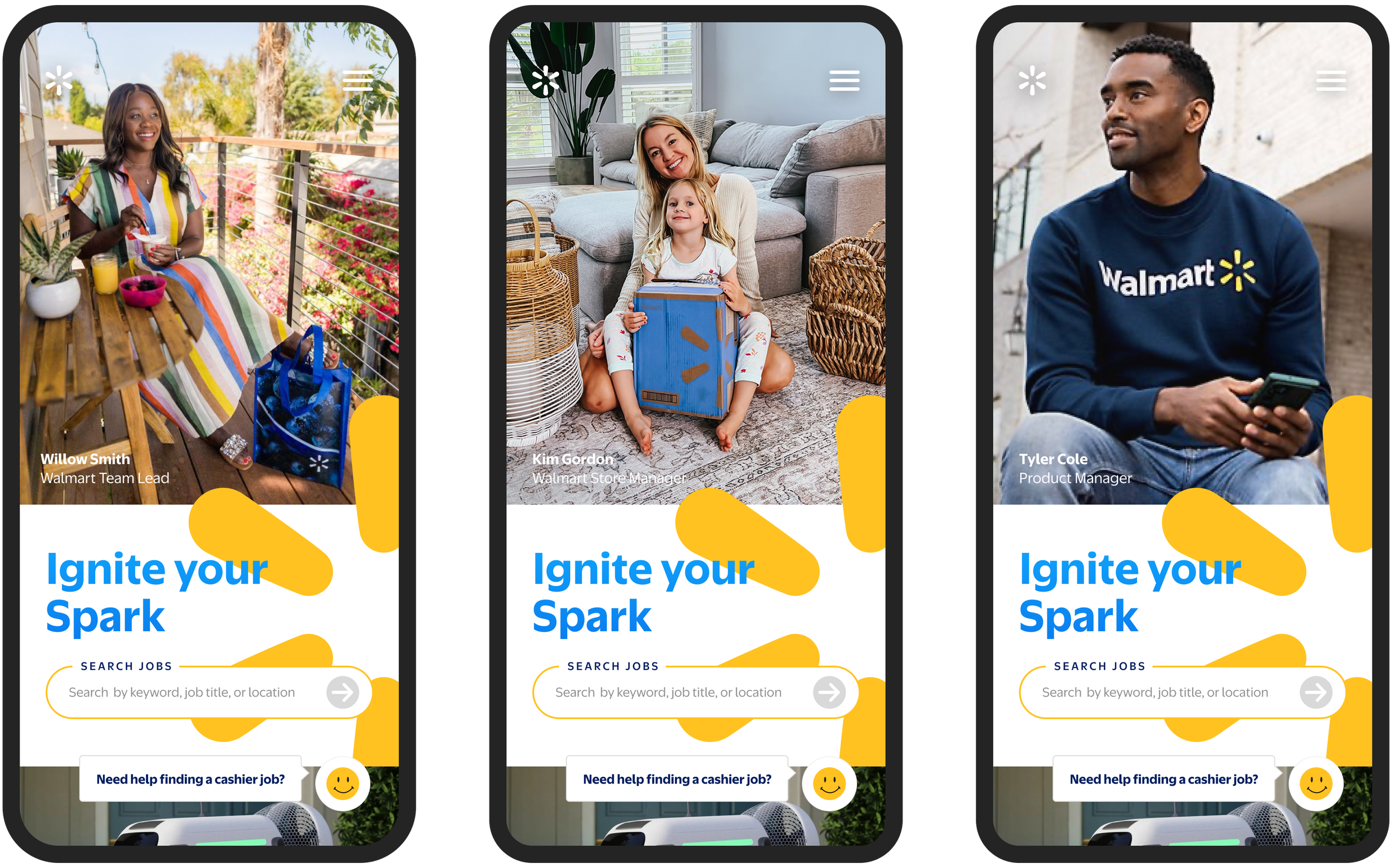
To communicate the vision clearly, I curated representative imagery and crafted a visual language that puts associates front and center — creating a warm, human-first experience that builds trust and invites job seekers to see themselves in the story.
- 1Each card used a different lifestyle setting — a balcony breakfast, a living room with a child, a casual portrait — instead of one studio shot repeated three times. That variety was meant to sell "day in the life" over "stock photo."
- 2The names and photography here are FPO — placeholder names paired with imagery I sourced myself, after hours of searching for shots that felt candid rather than corporate, so the direction would land with leadership before real associate photography was ever commissioned.
- 3The headline and search bar stayed identical across every variation — only the photography and the person changed — so the leadership conversation could stay focused on imagery direction instead of reopening the layout itself.
From Vision to Production
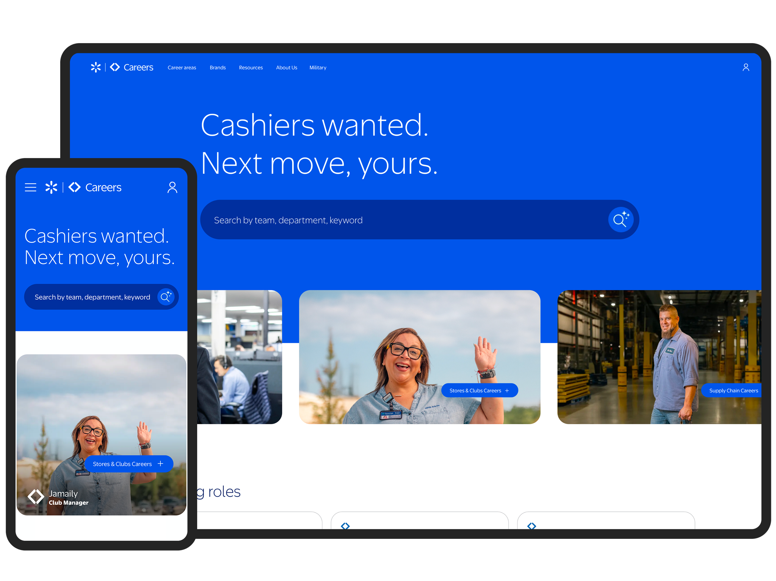
Following the proposal and early delivery phases, Deloitte completed the build. While I wasn't part of day-to-day production after that point, I remained involved in reviewing and approving the final experience before it shipped — the image above is what's live today.
— marks where day-to-day production handed off to Deloitte. I stayed involved through final approval.