A closer look at the moments that matter.
From mobile navigation and visual discovery to Room Fit and the smaller interaction decisions throughout the experience, this deep dive explores how the strategy translates into a more useful, confidence-building customer journey.
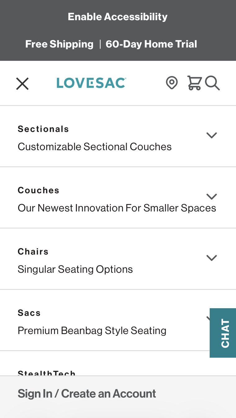
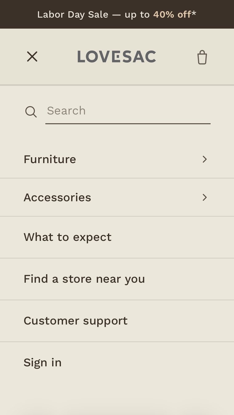
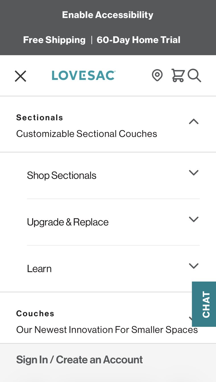
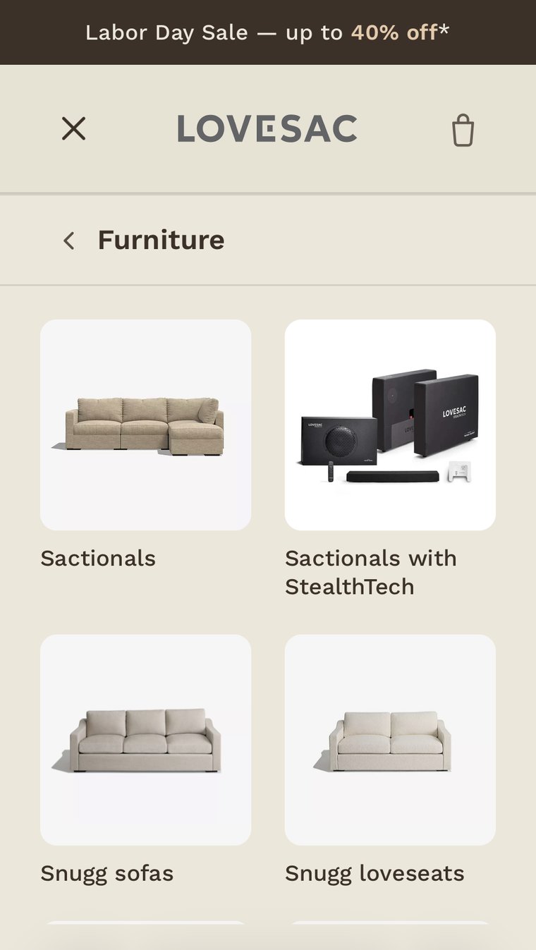
The same IA problem, compressed to a smaller screen.
When everything is prioritized, nothing is. The mobile redesign creates a clearer hierarchy so customers can get to the products and information that matter faster.
Room Fit: answering the one question every furniture shopper actually has.
Before someone commits to a Sactional configuration, they want to know one thing: will it fit? This feature answers that inline, without leaving the page.
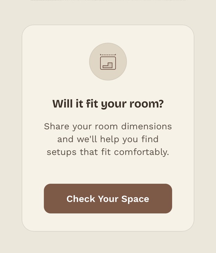
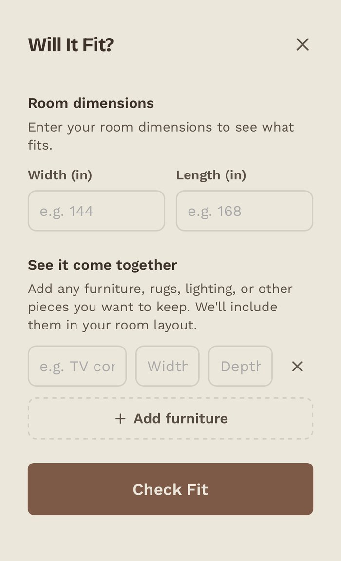
Two taps from "I like this" to "I know it'll fit."
The entry point is a simple, low-commitment card: a plain-language question and a single button, sitting right where a shopper is already evaluating a configuration. No app download, no account, no separate flow.
Opening it reveals a short form — room width and length, plus an optional section to add existing furniture so the layout accounts for what's already in the room. It's scoped to answer one question well, rather than becoming a full room-design tool.
- 1Removes a real purchase blocker. Furniture is a high-consideration purchase; "will it fit" is the anxiety that stalls a cart the most.
- 2Lives inline, not in a separate app. Lovesac's existing room-planning tool lives in a standalone app most shoppers never download; this puts the same idea one tap away from the product page.
- 3Start simple, build toward fit-aware shopping. The initial experience asks only for what's needed to answer the immediate fit question. A future version could use those dimensions to filter configurations, account for existing furniture, and visualize multiple layouts at true scale.
Accessibility isn't a toggle. It's the experience.
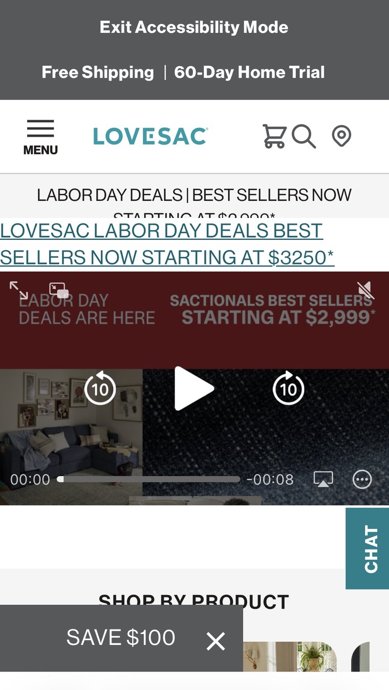
This is a live capture from the mobile site, not a mockup. Turning on "Accessibility Mode" overlays a second, misaligned promo banner on top of the first and leaves an autoplaying, sound-adjacent video sitting directly beneath it.

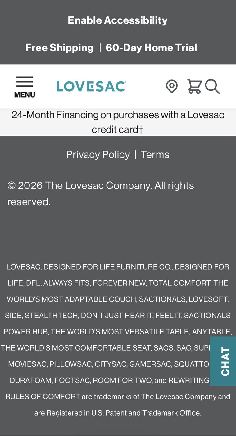
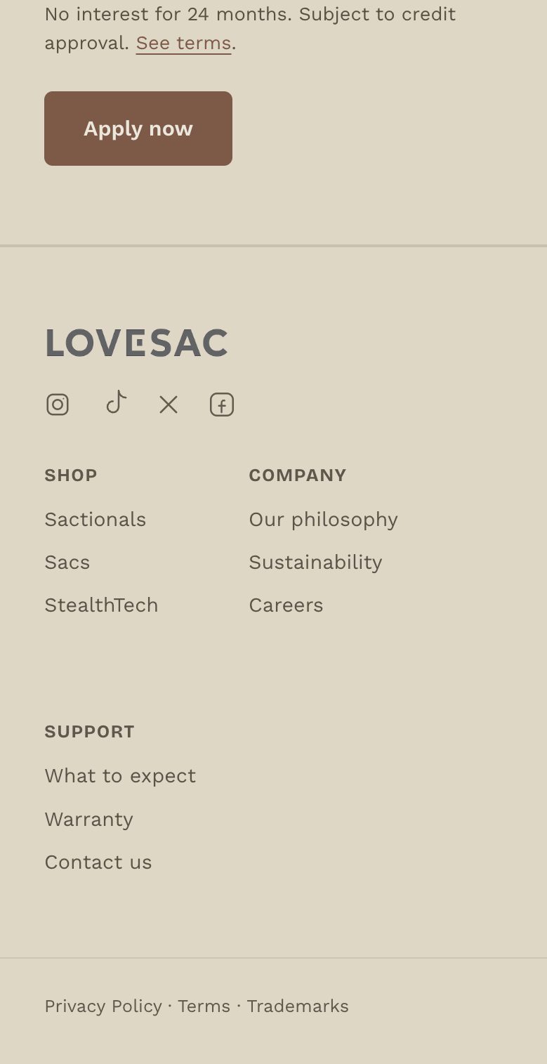
The footer is doing SEO the way it was done in 2008.
Scroll to the very bottom of the mobile site and the footer ends in an unbroken wall of trademarked product names — not a sitemap, not links, just plain visible text stacking every brand term the company owns.
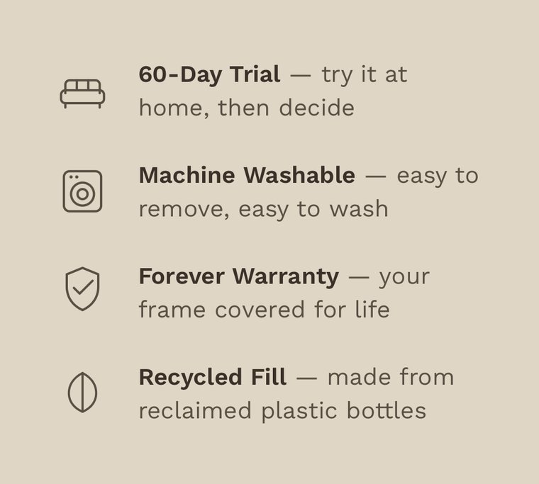
Confidence signals shouldn't be a scavenger hunt.
The real site's trust content — warranty, trial period, shipping, delivery — doesn't live on the homepage at all. It's on the Sactionals product page, collapsed behind four separate accordions a visitor has to find and tap open one at a time.

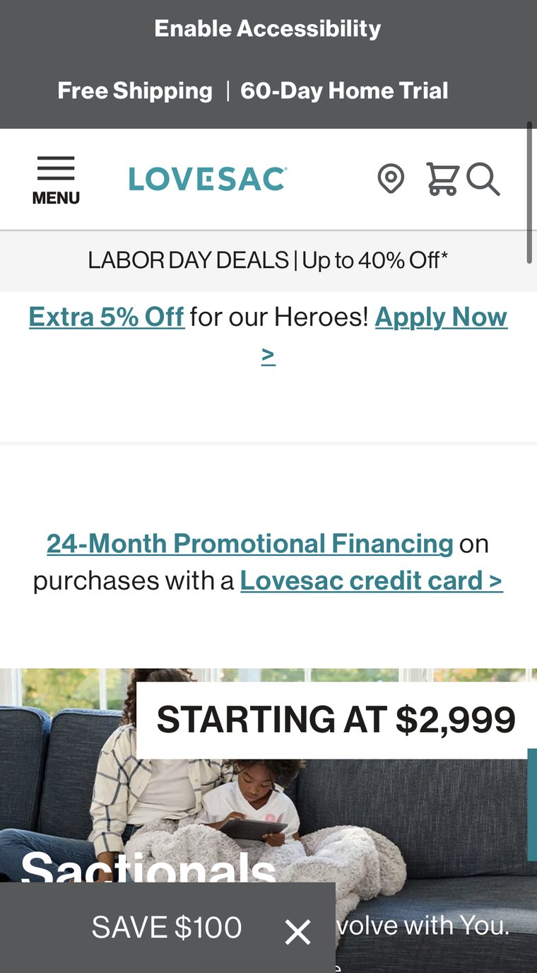
A 24-month financing offer with the visual weight of a footnote.
On the homepage, the financing offer appears as a simple text link between the "Shop by Product" section and an image carousel. There's little visual distinction to signal that it's a meaningful purchase consideration—especially for a high-ticket product.

Where these fixes came from.
This page covers the execution — the research behind why these details mattered lives on the next page.