Lovesac: from a viral critique to a full redesign.
What started as a critique became an opportunity to rethink the entire digital experience — from information architecture and accessibility to how the brand communicates value, flexibility, and trust.
The CEO mocked a customer. I looked at the experience.
"If I ran this company, this homepage wouldn't survive week one."
The project started with Lovesac CEO Shawn Nelson's response to customer Derick Cahill, who had spent $8,000 on a sectional. His response made me look more closely at the experience surrounding the product—and what the brand was communicating to its customers.
The homepage revealed a fragmented experience: cluttered navigation, discount-led messaging, and accessibility treated as a toggle rather than a foundation. What began as a reaction to the moment became an opportunity to rethink how Lovesac communicates its product, value, and brand online.
I approached it as a business problem: identify the friction, understand the opportunity, and build a better experience around the customer.
What the critique was actually about.
Four moments where the digital experience was creating friction instead of building confidence.
Discounts before story
The homepage leads with a red Labor Day banner and percent-off badges before the visitor understands what a "Sactional" is or why it's different from a normal couch.
Accessibility as a toggle
An "Enable Accessibility" link sits in the top utility bar — an overlay widget bolted onto the page, rather than contrast, hierarchy, and structure built in from the start.
Flat information architecture
Six-plus navigation categories, five stacked promotional carousels, and a footer split across four dense columns give every item equal visual weight — nothing tells the visitor where to start.
Product photography over lifestyle
Hero imagery is a dark, textured background carrying faint furniture silhouettes labeled with abstract phrases ("Cross Talk Mavericks," "Island Mentality") — striking, but it doesn't show a real couch in a real room.
The homepage, rebuilt from the top down.
Same product line, same brand equity — a homepage that leads with the story instead of the sale.
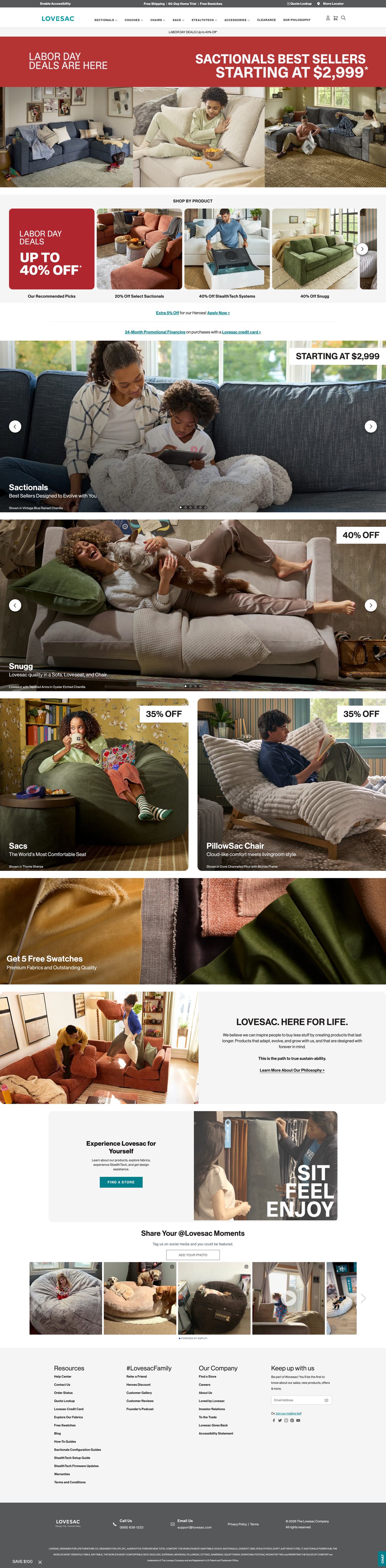 View full page ↗
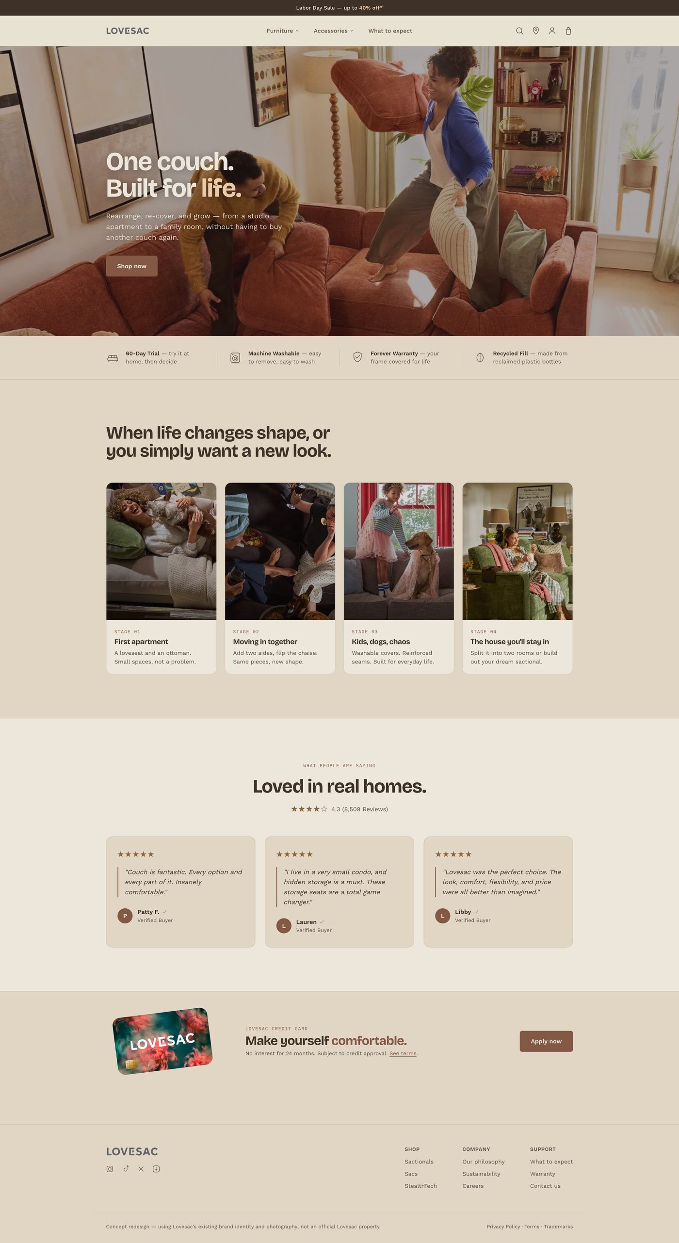 View full page ↗
The redesign replaces the abstract hero pattern with a single lifestyle photograph and a plain-language headline — "One couch. Built for life." — then immediately introduces four scannable reasons to believe: 60-day trial, machine washable, forever warranty, and recycled fill. Rather than asking visitors to piece together the product's value across the site, the redesign brings those differentiators into the first impression. The sale is still there; it simply no longer leads the experience.
Three problems, three deliberate fixes.
From flat to sequenced
- Collapsed a sprawling mega-menu into two clear categories — Furniture and Accessories — plus a dedicated "What to expect" page for pre-purchase questions.
- Replaced five separate percent-off carousels with one narrative section, "When life changes shape," that walks the product's modularity through four real life stages.
- Simplified the footer from four dense columns to three grouped by intent: Shop, Company, Support.
Built in, not bolted on
- Removed the standalone "Enable Accessibility" overlay link in favor of sufficient color contrast and semantic hierarchy on every page state.
- Swapped low-contrast text over a busy photographic background for a headline set against a clean, evenly-lit photograph.
- Kept navigation and CTAs to a consistent, predictable pattern so keyboard and screen-reader users aren't re-learning structure per section.
Story before sale
- Reordered the page so brand promise → trust signals → lifecycle story → social proof leads, and promotions support rather than open the experience.
- Softened the palette from Lovesac's stock red-banner promo styling to a warmer, editorial neutral that reads closer to a furniture brand than a flash sale.
- Tightened review content to three high-signal quotes with a single aggregate rating, instead of scattered testimonials competing with product grids.
From a critique to a portfolio piece.
- Wendy's — commented
- La-Z-Boy — engaged
- Sephora — liked
See the full redesign.
This case study covers the thinking — the working prototype brings the concept to life.