Dimensional Fund Advisors Customer Dashboard Redesign
Role: UX/UI Designer
Company: Dimensional Fund Advisors
Skills Used: Dashboard Design, UI/UX Research, Responsive Design, Development Collaboration
Overview
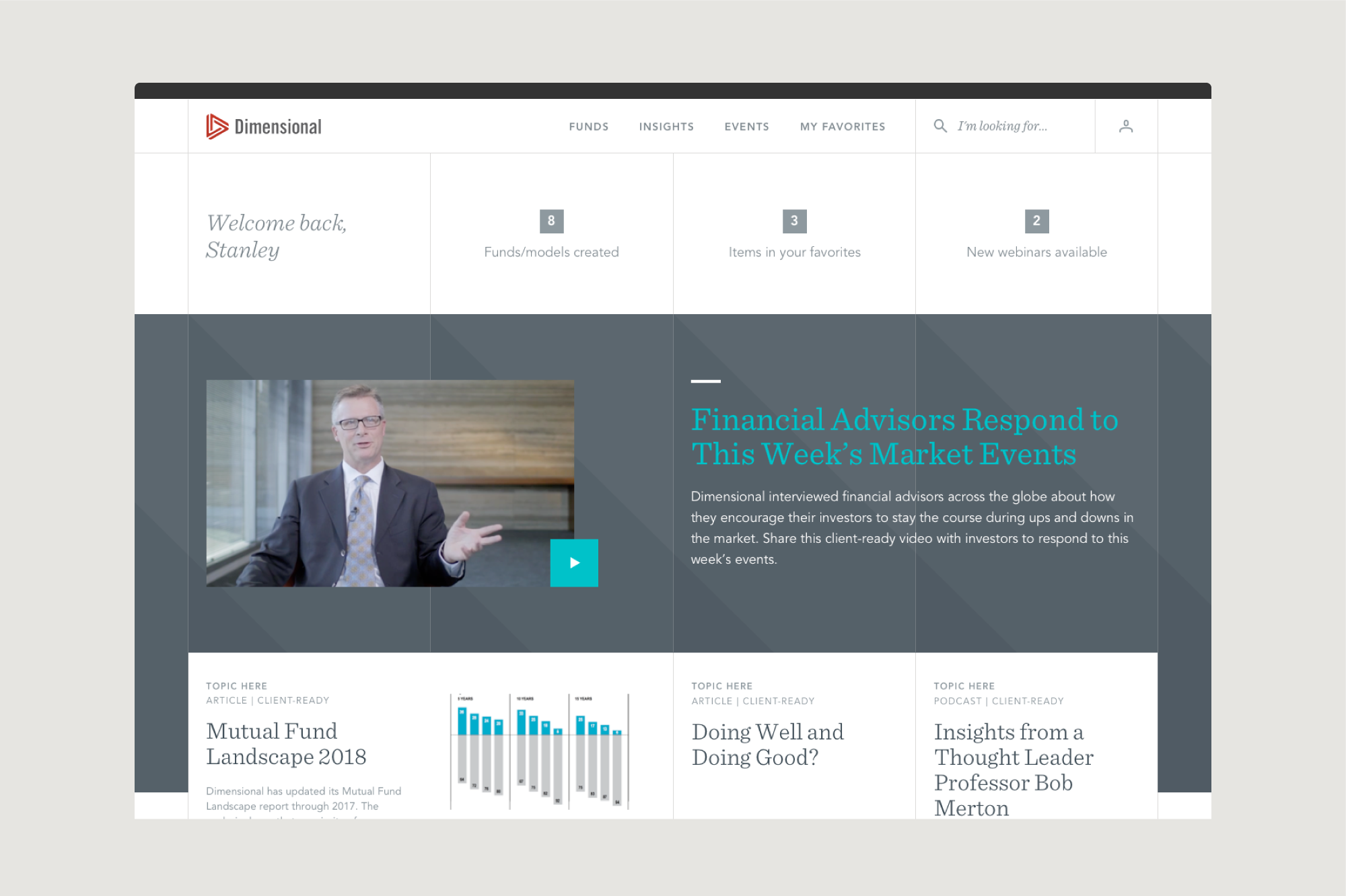
Dimensional Fund Advisors needed a redesigned customer dashboard that provided a more intuitive and user-friendly experience across both desktop and mobile platforms. The goal was to enhance usability while maintaining brand consistency and ensuring a seamless flow of information for users.
Problem Statement
The existing customer dashboard had usability challenges and did not fully align with modern UI/UX standards. The key issues included:
A lack of clarity in the information hierarchy, making it difficult for users to find relevant content.
Limited adaptability to mobile, leading to an inconsistent user experience across devices.
The need for new features and interactive components to improve engagement and efficiency.
Development constraints that required balancing feasibility with design innovation.
Approach and Process
Research and UI/UX Strategy
Conducted an analysis of best practices for financial dashboards to identify areas for improvement.
Researched user behavior to understand how different customer segments interacted with the dashboard.
Collaborated with developers to ensure feasibility while pushing for innovative design improvements.
Design Execution
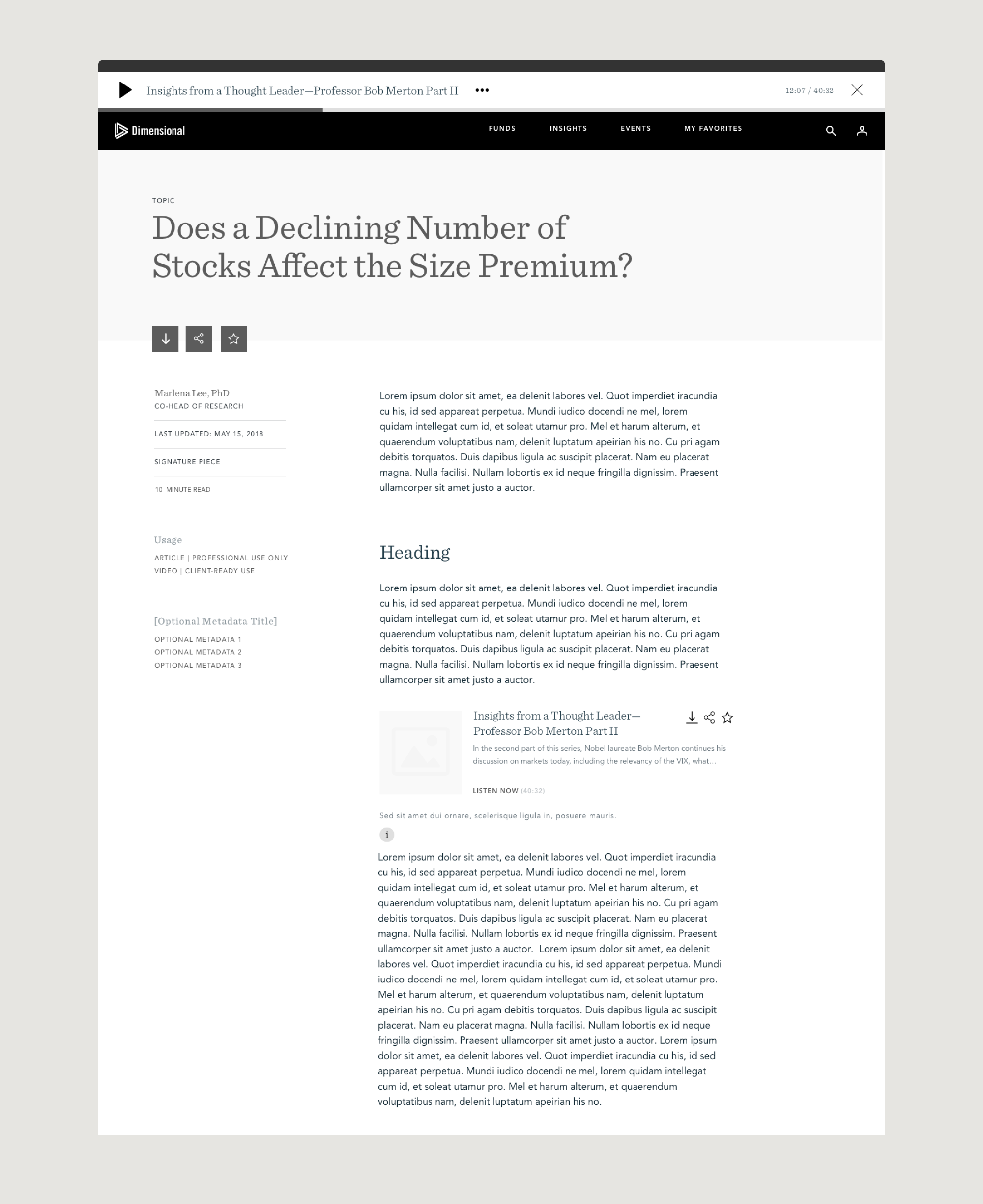
Designed multiple dashboard components, ensuring visual consistency and ease of use.
Focused on responsive design to create a seamless experience across mobile and desktop.
Introduced interactive elements to enhance engagement, such as personalized content sections and improved filtering options.
Cross-Functional Collaboration
Worked closely with product managers, developers, and other designers to align design decisions with business objectives.
Ensured that all new features adhered to Dimensional Fund Advisors' brand identity while improving functionality.
Iterated on designs based on stakeholder and user feedback to refine the experience.
Solution
A redesigned customer dashboard that improved navigation, usability, and accessibility across all devices.
A mobile-friendly interface that provided the same level of functionality and clarity as the desktop version.
New interactive components that enhanced user engagement and made content more digestible.
A balance between innovative design and technical feasibility, ensuring smooth implementation.
Results and Impact
Improved user experience with a more structured and accessible dashboard layout.
Increased engagement through enhanced filtering, personalized content, and responsive design.
Positive feedback from stakeholders and users, validating the improvements.
A scalable design system that could accommodate future enhancements and additional features.
Key Takeaways
Designing within development constraints requires strategic collaboration to find the right balance between feasibility and innovation.
A responsive-first approach ensures consistency and usability across different devices.
A well-structured information hierarchy is critical for financial dashboards to improve clarity and efficiency.