The Business Case
What started with a founder and CEO publicly poking fun at a customer became an opportunity to rethink the experience, the product, and the business around it.
The product is flexible. The experience isn't.
Lovesac sells a highly configurable product, but its digital experience made that complexity harder to navigate, understand, and act on. The opportunity was to bring the same clarity, flexibility, and confidence to the customer journey.
- 1The value proposition isn't clear enough. Customers encounter promotions and product terminology before they understand what makes Lovesac different or why the product is worth the investment.
- 2The experience creates unnecessary complexity. Navigation, product choices, and content make a highly configurable product feel harder to understand rather than easier.
- 3The experience doesn't build enough purchase confidence. Important questions — will it fit? How does it work? What happens after I buy? Can I live with it? — aren't answered at the moments customers need them.
- 4The digital experience isn't delivering on the brand promise. A company selling flexibility and longevity presents an experience that can feel cluttered, promotional, and reactive rather than considered and premium.
Turn complexity into confidence.
The strategy was simple: remove friction from the customer journey without removing the flexibility that makes the product different. That meant simplifying discovery, bringing critical purchase questions into the experience, and making accessibility part of the foundation rather than an optional layer.
- 1Simplify discovery. Visual navigation, clearer hierarchy, fewer competing paths.
- 2Make the product easier to understand. Stronger value communication and more useful product information.
- 3Build purchase confidence. Room Fit, clearer expectations, trial and warranty information.
- 4Make accessibility foundational. Contrast, focus states, heading structure, skip navigation, no autoplay.
Public reviews back some of it up.
A pass through Reddit threads, BBB complaints, and review sites — no internal analytics, no usability testing.
What real compensation looks like.
Derick Cahill was offered a pair of floral gardening gloves, size small. This case study is what happens when you take the actual problem seriously instead: a rebuilt information architecture, accessibility built in rather than bolted on, and a homepage that leads with the brand instead of the discount.
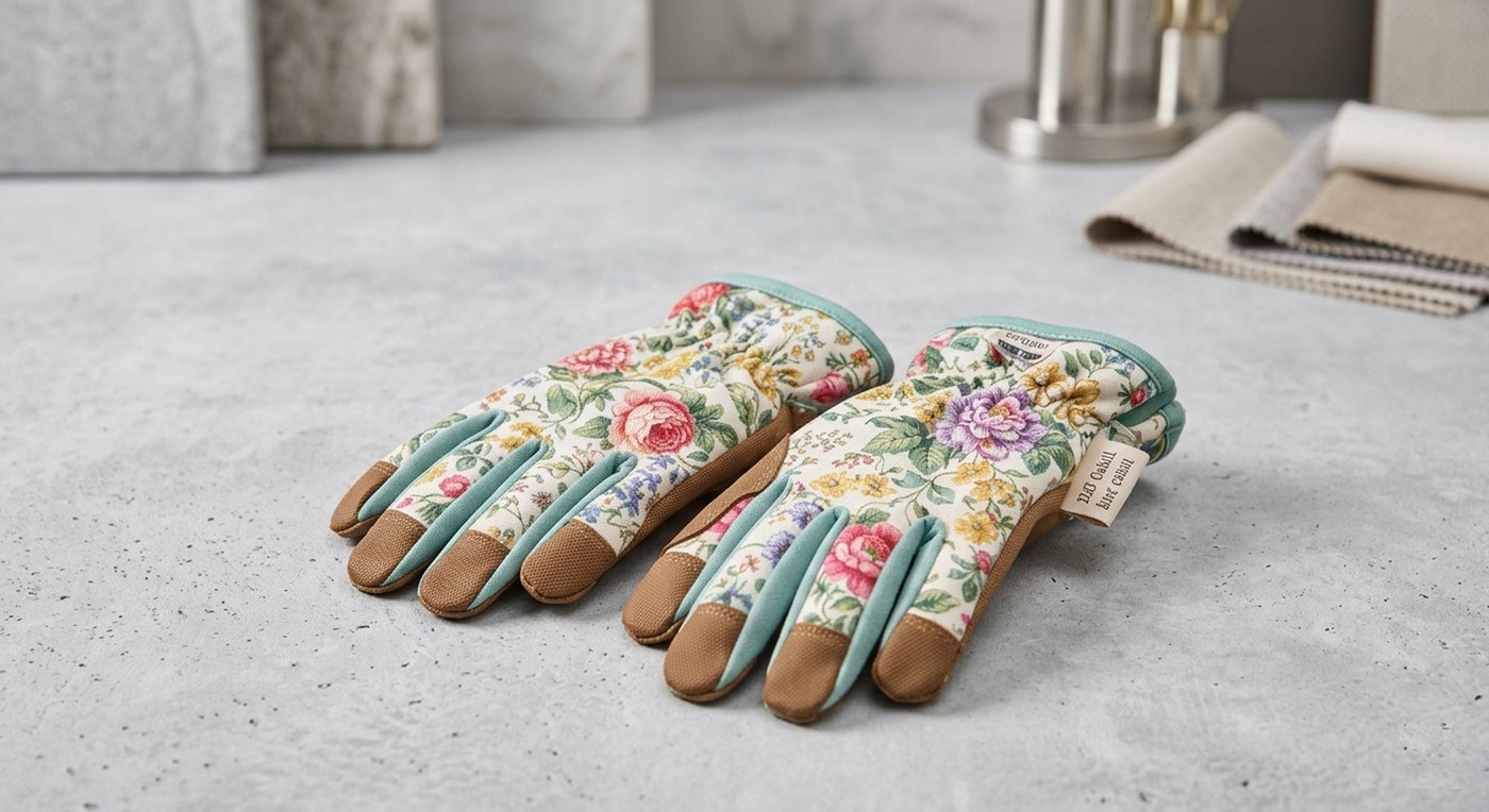
The actual gloves.
See it in the browser.
This synopsis covers the shape of it — the working prototype shows the execution.